New Figma properties
30 September 2022

Figma’s new update to component properties brings about one of the things I had been missing for a long time — composition. We can now have exposed sub components inside larger building blocks and templates.
Of course I'm talking about “Nested instances”. The best way to truly understand any new feature is to build something with it. What I’ll be tackling is the macOS Menu List component.
It consists of:
- Header (not shown in the screenshot)
- Divider
- Item
- Container
I’ll be using an 8px system instead of Apple’s 5px
Let’s break down each item of this list.
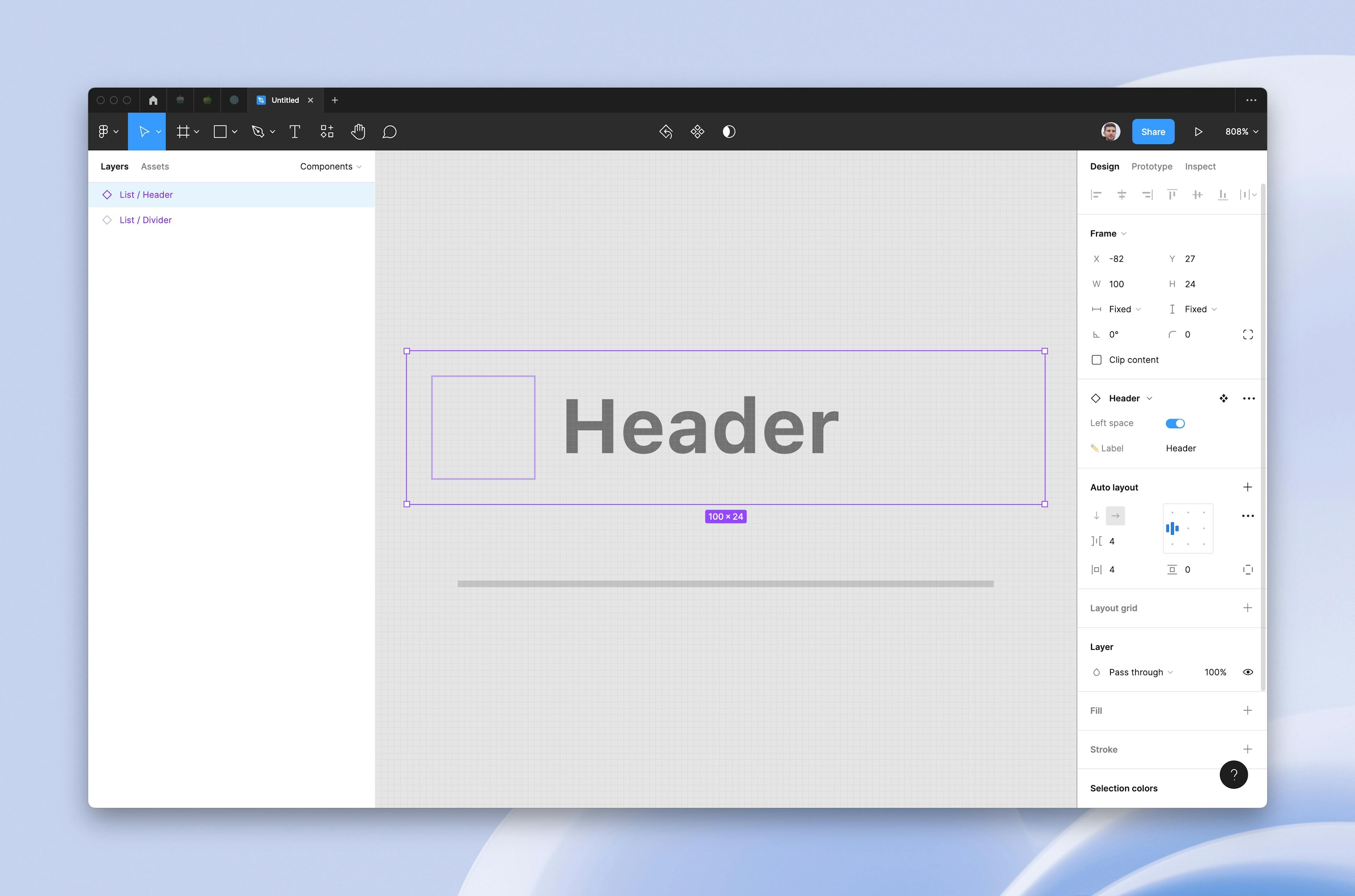
Header + Divider
I’m grouping these two since they are pretty straight forward. We just have a fixed height frame with a text field/line inside that should span the entire width of it.
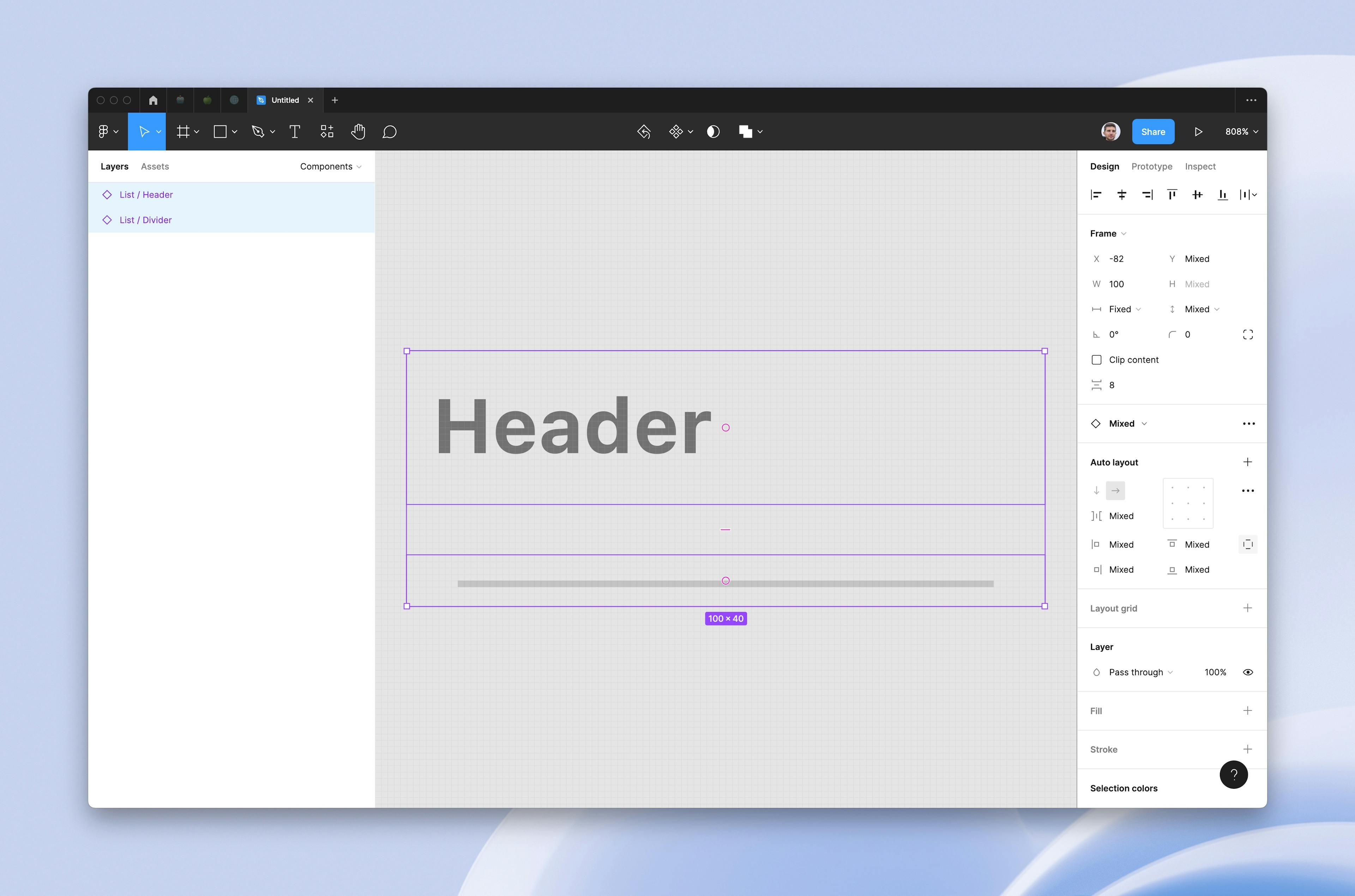
The header needs to have a property to be inset if needed.
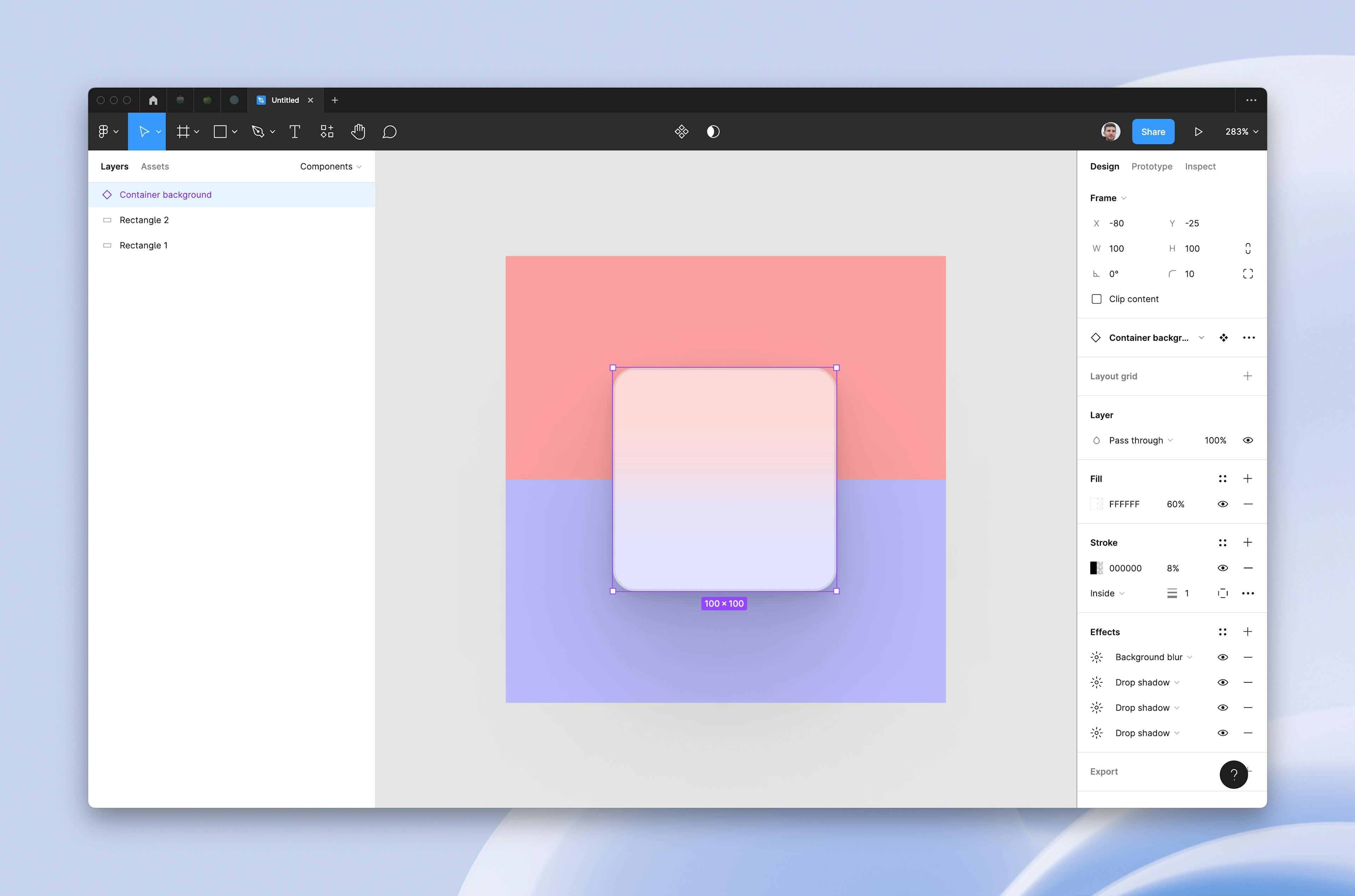
Container
I’m separating the container as a standalone component and will be using Figma’s Position Fixed feature to insert it into the Auto Layout stack. There is a background blur and a subtle border as well Apple’s signature 🤌 shadows.
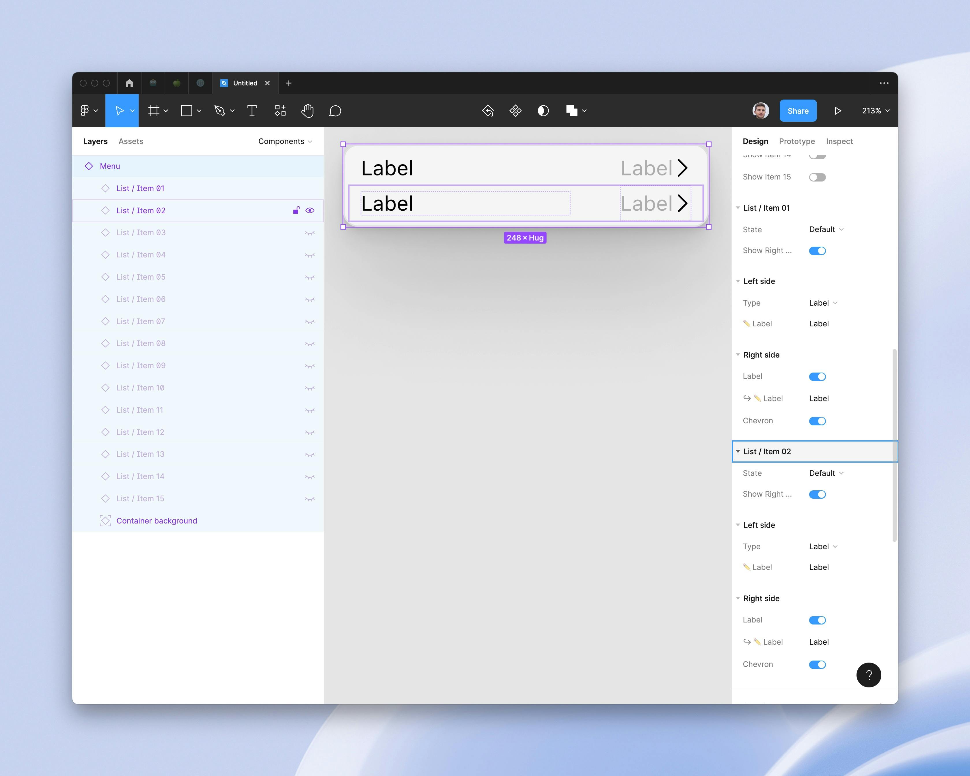
List item
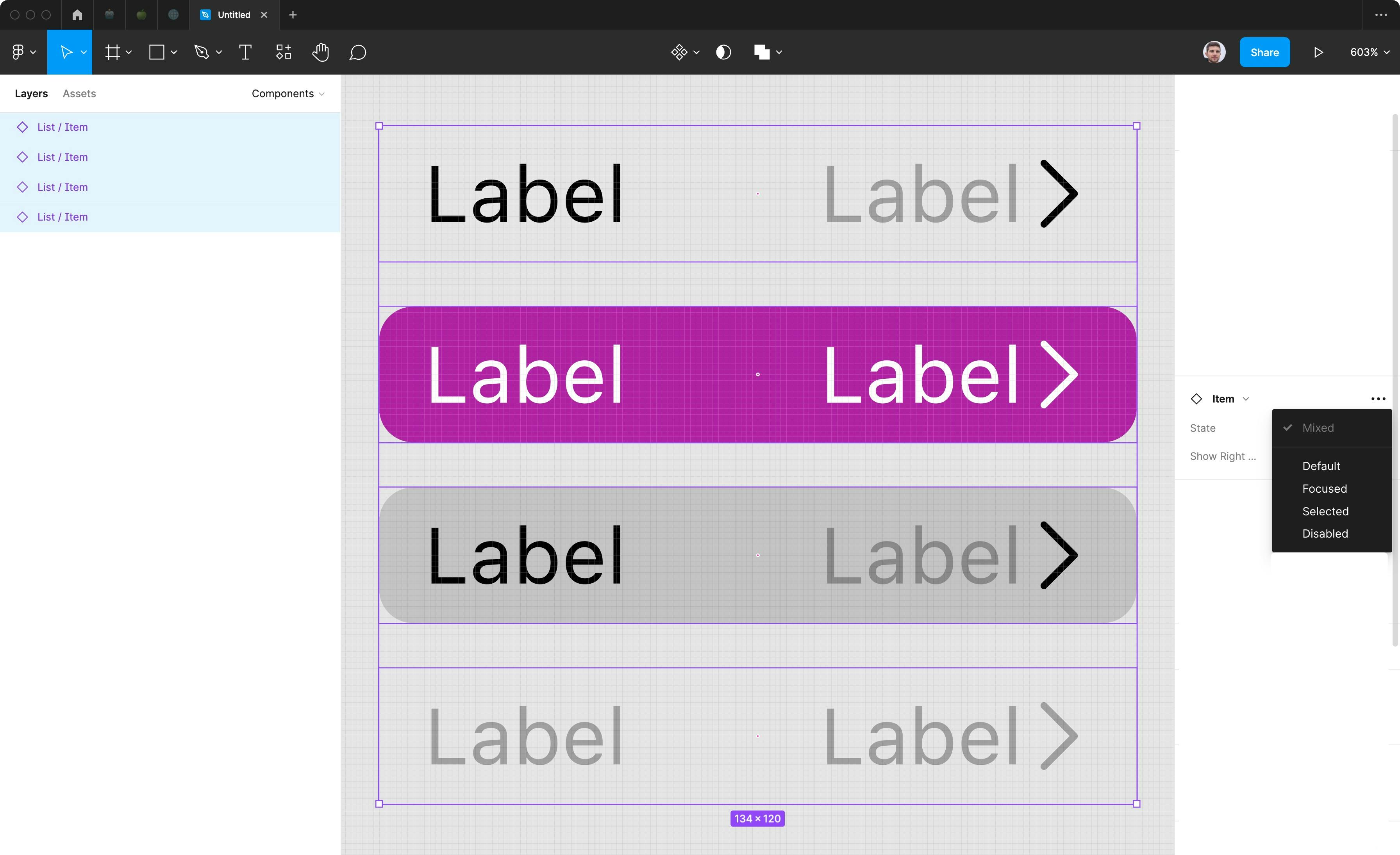
Here’s where the fun part starts. I’ll be separating the item in several sub items and states:
- Left side
- Right side
- States:
- Default
- Focused
- Selected
- Disabled
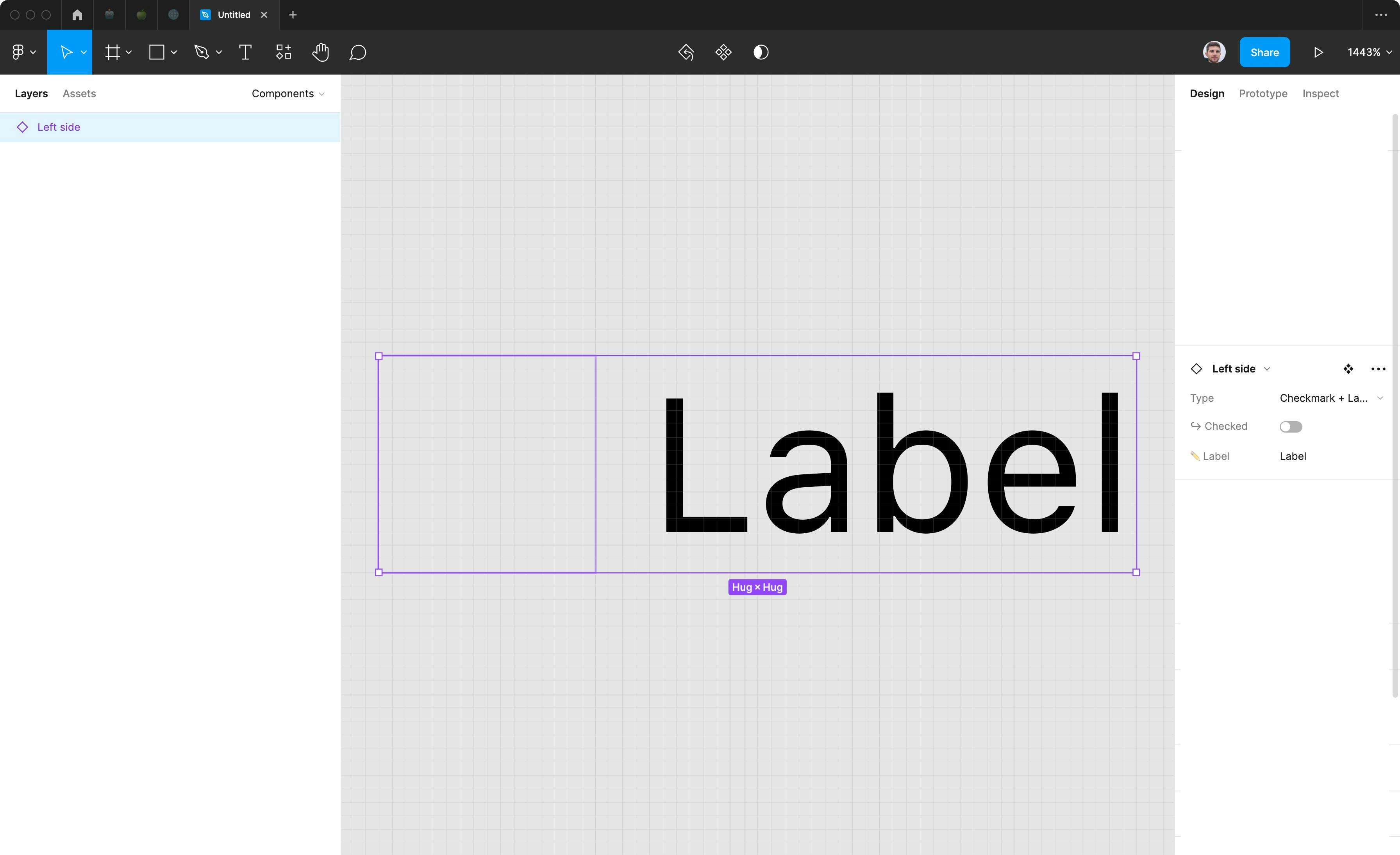
Left side
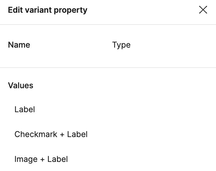
Left side has 4 ways it can go. It can be just text, text with left space, check mark + text and image + text.
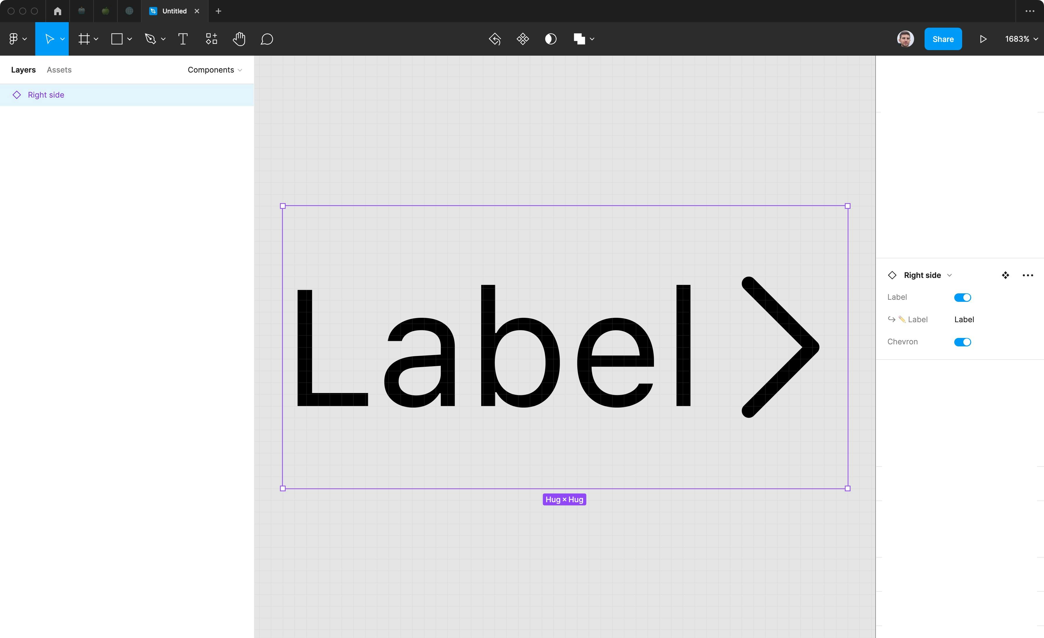
Right side
Right side can be empty, have text only, chevron only and text + chevron.
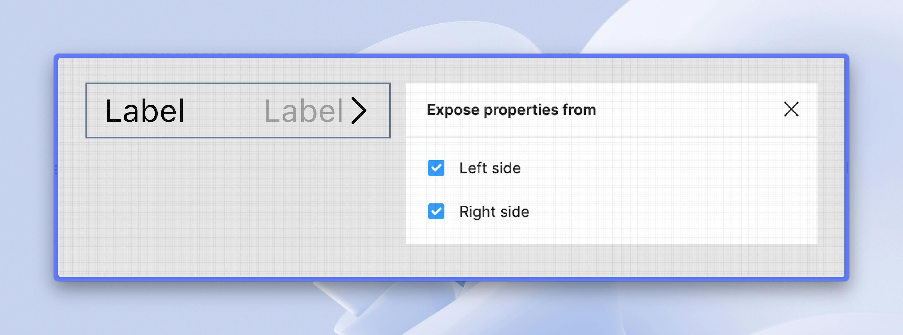
I opted to make them all be toggles for easier consumption
From the left... to the right
Making all these as separate variants would create a giant mess of a component and we would need to update a lot of items. With the old way of doing this, we’d leave the component as is and educate the consumers of the system to know how to drill down and change the properties that way. It’s not the best way, but it works. With nested instances, we mitigate this step since we leverage the ones we want on top.
States, oh states
This is perhaps the most beneficial part of the “lego” approach. If the item variant option was going to result in a huge component, adding states to the equation would make it even more so.
With this new feature, we just expose the sides and do variants for the states only and we get a much cleaner component.
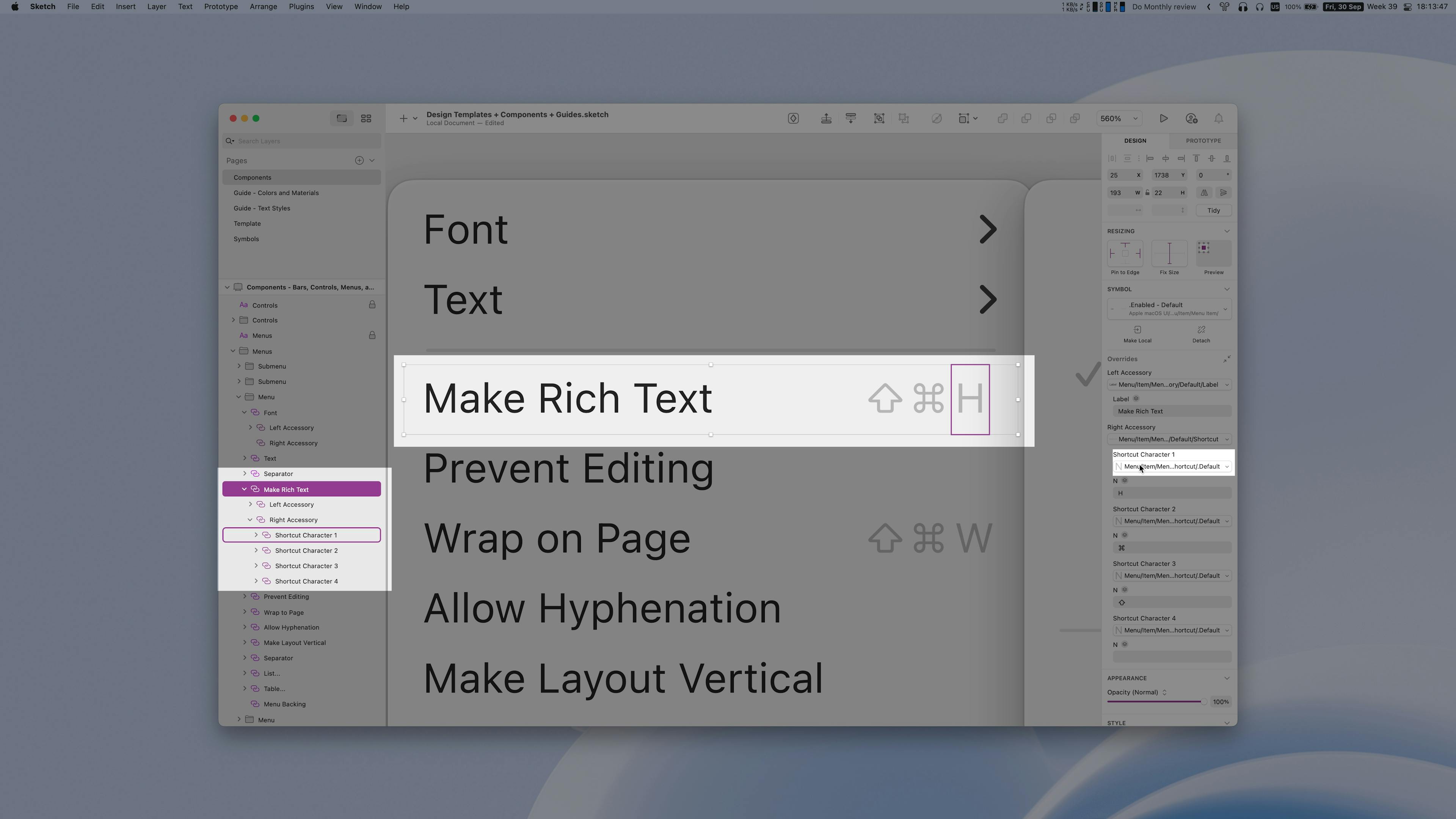
“And I'll form the head!”
At this stage is where it feels a lot like Voltron where we combine all the pieces in our giant (mech) component. We get all our pieces and form a single long list with items.
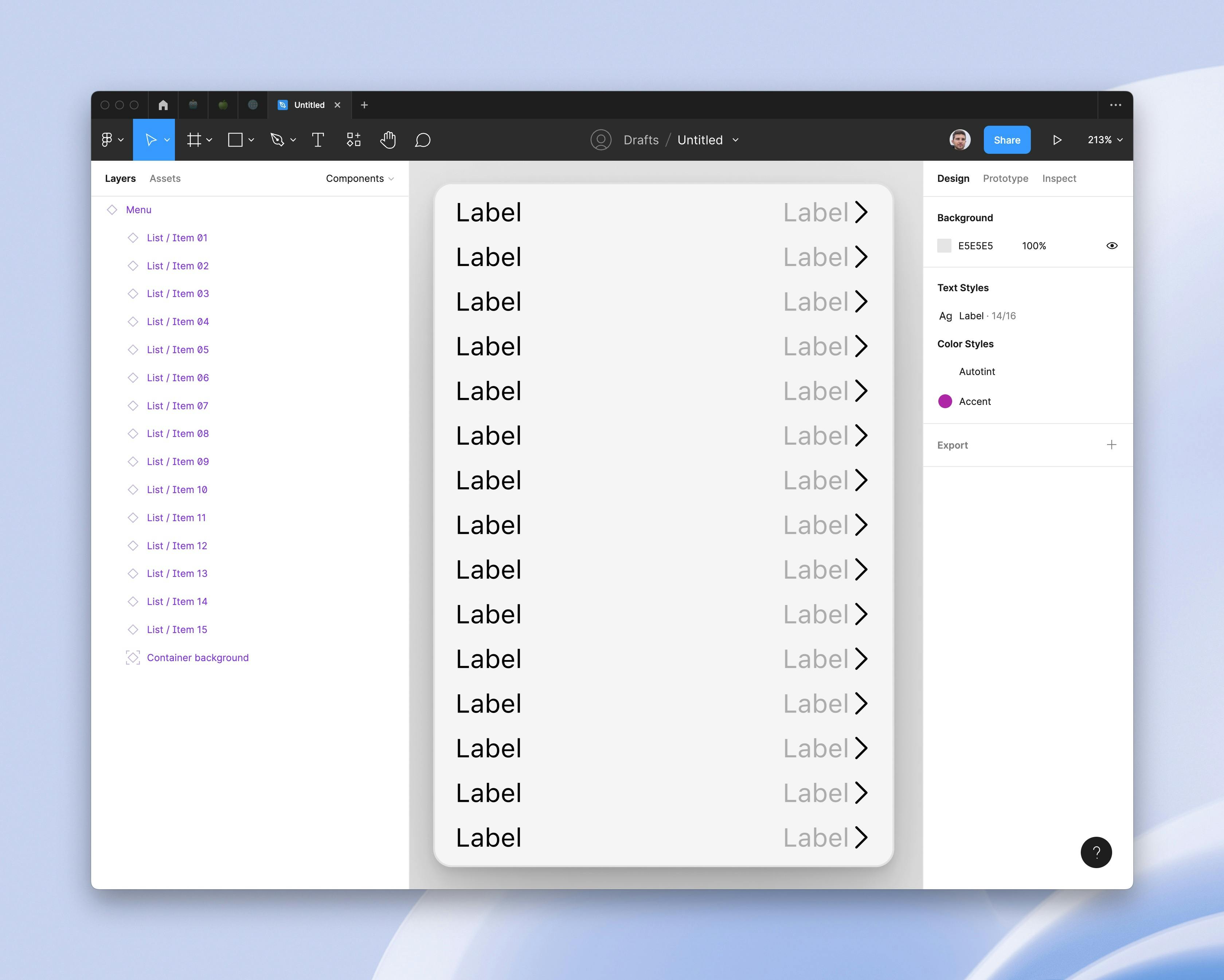
This is where the drawback for exposing the nested components breaks a bit for me. If we expose all the rows, we create a big scrollable list if items which is daunting to use.
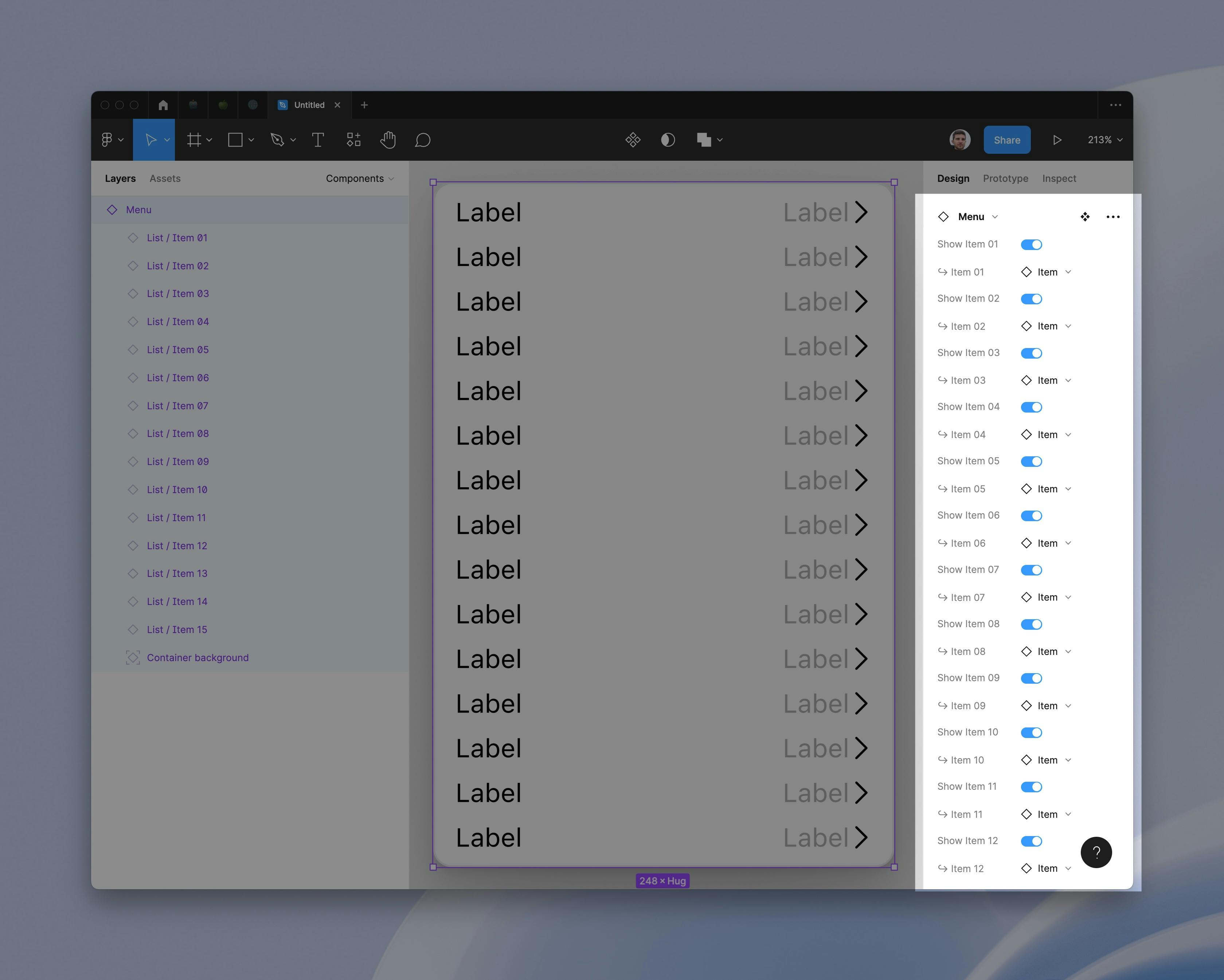
Once you've decided how many items you will need, you still need to go through the list of options for each row and select what you want from it
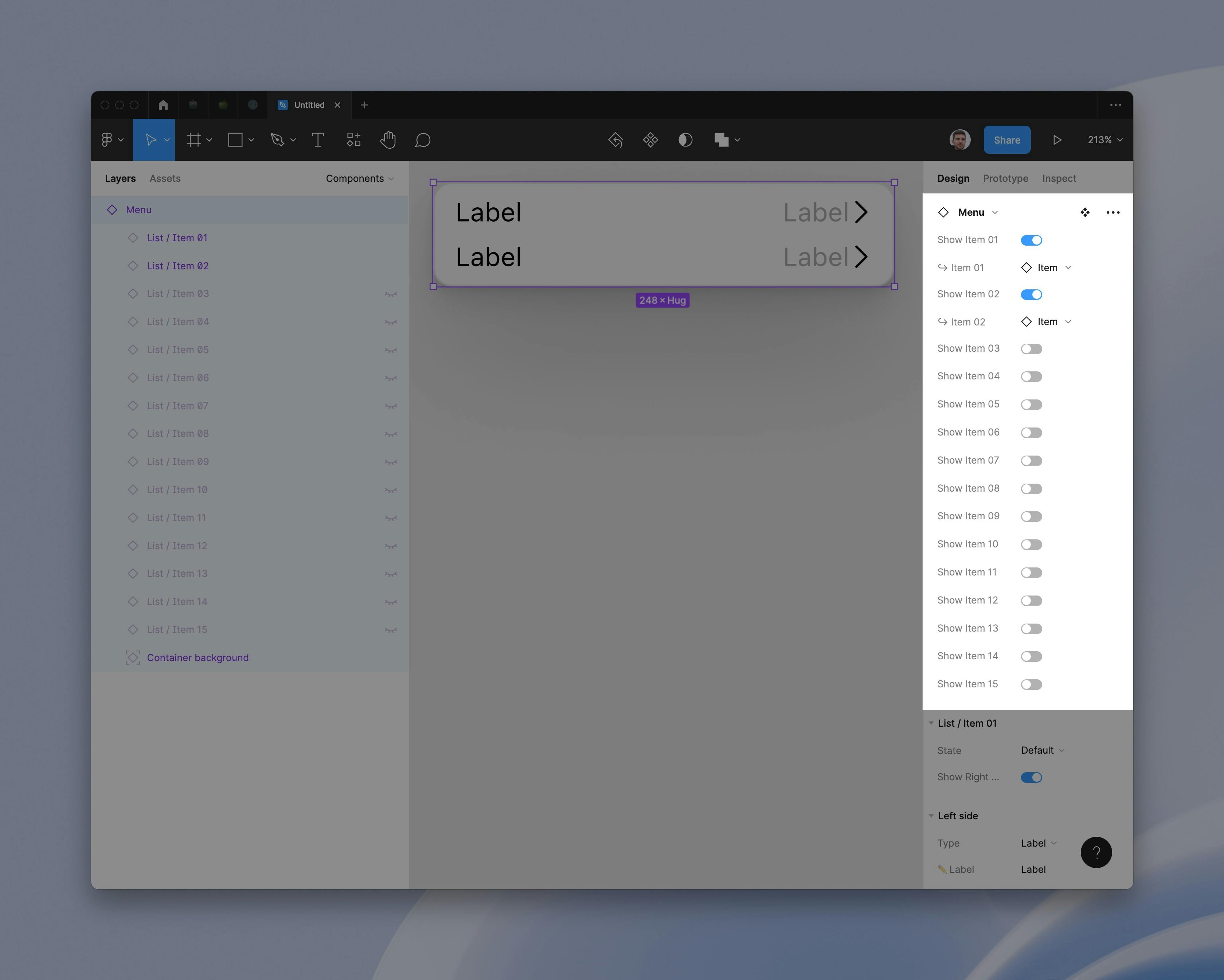
I believe it's much more usable to leave the nested items unexposed as to not overwhelm the consumers. It’s better to get inside and select the ones you want to change/edit for a much more focused way rather than count the rows and see where you are in the edit.
Figma does highlight on which item you are currently so you can orient yourself, but it goes only on the first level. Sketch does this no matter how deep you go in the three and hightlights the layer pannel better.
Conclusion
This new feature improvement will allow us to create components that are easier for others to understand and use within our designs and will help with design systems because they are getting so large and complex that maintaining them is like maintaining code.
If you are interested in inspecting how the components are built, feel free to check out the file ↗ for yourself.